干货分享 超炫丽的HTML5/jQuery应用及代码
今天我们要来分享一些HTML5干货,对于前段开发者来说,这些HTML5应用和jQuery插件将会让你的项目更加生动和炫丽,至少在UI设计方面,或多或少会带给你一点设计灵感,赶紧收藏和分享吧。另外这些HTML5应用的源代码也一并分享了。
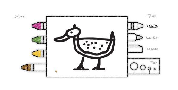
HTML5 Canvas画板画图工具 可定义笔刷和画布
这是一款基于HTML5 Canvas的网络画板应用,简化版的,可以自己在上面扩展。
核心jQuery代码:
HTML5 Canvas画板画图工具 可定义笔刷和画布
这是一款基于HTML5 Canvas的网络画板应用,简化版的,可以自己在上面扩展。
核心jQuery代码:
- function prepareCanvas()
- {
- // Create the canvas (Neccessary for IE because it doesn't know what a canvas element is)
- var canvasDiv = document.getElementById('canvasDiv');
- canvas = document.createElement('canvas');
- canvas.setAttribute('width', canvasWidth);
- canvas.setAttribute('height', canvasHeight);
- canvas.setAttribute('id', 'canvas');
- canvasDiv.appendChild(canvas);
- if(typeof G_vmlCanvasManager != 'undefined') {
- canvas = G_vmlCanvasManager.initElement(canvas);
- }
- context = canvas.getContext("2d"); // Grab the 2d canvas context
- // Note: The above code is a workaround for IE 8 and lower. Otherwise we could have used:
- // context = document.getElementById('canvas').getContext("2d");
-
- // Load images
- // -----------
- crayonImage.onload = function() { resourceLoaded();
- };
- crayonImage.src = "images/crayon-outline.png";
- //context.drawImage(crayonImage, 0, 0, 100, 100);
-
- markerImage.onload = function() { resourceLoaded();
- };
- markerImage.src = "images/marker-outline.png";
-
- eraserImage.onload = function() { resourceLoaded();
- };
- eraserImage.src = "images/eraser-outline.png";
-
- crayonBackgroundImage.onload = function() { resourceLoaded();
- };
- crayonBackgroundImage.src = "images/crayon-background.png";
-
- markerBackgroundImage.onload = function() { resourceLoaded();
- };
- markerBackgroundImage.src = "images/marker-background.png";
-
- eraserBackgroundImage.onload = function() { resourceLoaded();
- };
- eraserBackgroundImage.src = "images/eraser-background.png";
- crayonTextureImage.onload = function() { resourceLoaded();
- };
- crayonTextureImage.src = "images/crayon-texture.png";
-
- outlineImage.onload = function() { resourceLoaded();
- };
- outlineImage.src = "images/watermelon-duck-outline.png";
- // Add mouse events
- // ----------------
- $('#canvas').mousedown(function(e)
- {
- // Mouse down location
- var mou** = e.pageX - this.offsetLeft;
- var mouseY = e.pageY - this.offsetTop;
-
- if(mou** < drawingAreaX) // Left of the drawing area
- {
- if(mou** > mediumStartX)
- {
- if(mouseY > mediumStartY && mouseY < mediumStartY + mediumImageHeight){
- curColor = colorPurple;
- }else if(mouseY > mediumStartY + mediumImageHeight && mouseY < mediumStartY + mediumImageHeight * 2){
- curColor = colorGreen;
- }else if(mouseY > mediumStartY + mediumImageHeight * 2 && mouseY < mediumStartY + mediumImageHeight * 3){
- curColor = colorYellow;
- }else if(mouseY > mediumStartY + mediumImageHeight * 3 && mouseY < mediumStartY + mediumImageHeight * 4){
- curColor = colorBrown;
- }
- }
- }
- else if(mou** > drawingAreaX + drawingAreaWidth) // Right of the drawing area
- {
- if(mouseY > toolHotspotStartY)
- {
- if(mouseY > sizeHotspotStartY)
- {
- var sizeHotspotStartX = drawingAreaX + drawingAreaWidth;
- if(mouseY < sizeHotspotStartY + sizeHotspotHeight && mou** > sizeHotspotStartX)
- {
- if(mou** < sizeHotspotStartX + sizeHotspotWidthObject.huge){
- curSize = "huge";
- }else if(mou** < sizeHotspotStartX + sizeHotspotWidthObject.large + sizeHotspotWidthObject.huge){
- curSize = "large";
- }else if(mou** < sizeHotspotStartX + sizeHotspotWidthObject.normal + sizeHotspotWidthObject.large + sizeHotspotWidthObject.huge){
- curSize = "normal";
- }else if(mou** < sizeHotspotStartX + sizeHotspotWidthObject.small + sizeHotspotWidthObject.normal + sizeHotspotWidthObject.large + sizeHotspotWidthObject.huge){
- curSize = "small";
- }
- }
- }
- else
- {
- if(mouseY < toolHotspotStartY + toolHotspotHeight){
- curTool = "crayon";
- }else if(mouseY < toolHotspotStartY + toolHotspotHeight * 2){
- curTool = "marker";
- }else if(mouseY < toolHotspotStartY + toolHotspotHeight * 3){
- curTool = "eraser";
- }
- }
- }
- }
- else if(mouseY > drawingAreaY && mouseY < drawingAreaY + drawingAreaHeight)
- {
- // Mouse click location on drawing area
- }
- paint = true;
- addClick(mou**, mouseY, false);
- redraw();
- });
-
- $('#canvas').mousemove(function(e){
- if(paint==true){
- addClick(e.pageX - this.offsetLeft, e.pageY - this.offsetTop, true);
- redraw();
- }
- });
-
- $('#canvas').mouseup(function(e){
- paint = false;
- redraw();
- });
-
- $('#canvas').mouseleave(function(e){
- paint = false;
- });
- }
在线演示 源码下载
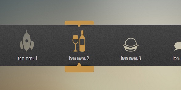
HTML5/CSS3滑块动画菜单 图标动画很酷
非常实用的鼠标跟随滑动菜单,挺不错的。
核心CSS代码:
- #menu ul{
- position:relative;
- }
- #menu ul:after{
- content:"";
- display:block;
- clear:both;
- }
- #menu a{
- color:#D8D8D8;
- text-decoration:none;
- display:block;
- width:100%;
- height:100%;
- text-shadow: 0 -1px 0 #000;
- }
- #menu li:after {
- content: "";
- width: 9.5238%;
- height: 100%;
- position: absolute;
- top: 0;
- right: -9.5238%;
- background: url('css/menu-bg.png');
- }
- .rocket:before {
- content: "";
- width: 9.5238%;
- height: 100%;
- position: absolute;
- top: 0;
- left: -9.5238%;
- background: url('css/menu-bg.png');
- border-radius: 5px 0px 0px 5px;
- }
- .earth:after{
- border-radius:0px 5px 5px 0px;
- }
- .current{
- position:absolute;
- top:-13px;
- left:8.92857%;
- margin-left: -49px;
- width:95px;
- height:165px;
- -webkit-transition: all 400ms cubic-bezier(.45,1.92,.9,1.54);
- -moz-transition: all 400ms cubic-bezier(.45,1.92,.9,1.54);
- -o-transition: all 400ms cubic-bezier(.45,1.92,.9,1.54);
- -ms-transition: all 400ms cubic-bezier(.45,1.92,.9,1.54);
- transition: all 400ms cubic-bezier(.16,1.23,.87,1.18);
- }
- .current-back{
- width:100%;
- height:100%;
- position:absolute;
- background:#c39449;
- border-radius:5px;
- border-bottom: 2px solid rgba(0, 0, 0, 0.09);
- border-top: 2px solid rgba(255,255,255,0.1);
- }
- .top-arrow{
- position:absolute;
- overflow:hidden;
- width:100%;
- height:12px;
- top:13px;
- left:0;
- z-index:2;
- }
- .top-arrow:before{
- content:"";
- position:absolute;
- width:80%;
- height:10px;
- top:-10px;
- left:10%;
- border-radius:20%;
- box-shadow:0 0 10px black;
- }
- .top-arrow:after{
- content:"";
- position:absolute;
- width:0;
- height:0;
- top:0px;
- border-top:8px solid #c39449;
- border-left:6px solid transparent;
- border-right:6px solid transparent;
- margin-left:-6px;
- left:50%;
- }
- .bottom-arrow{
- position:absolute;
- overflow:hidden;
- width:100%;
- height:12px;
- bottom:17px;
- left:0;
- z-index:2;
- }
- .bottom-arrow:before{
- content:"";
- position:absolute;
- width:80%;
- height:10px;
- bottom:-10px;
- left:10%;
- border-radius:20%;
- box-shadow:0 0 10px black;
- }
- .bottom-arrow:after{
- content:"";
- position:absolute;
- width:0;
- height:0;
- bottom:0;
- border-bottom:12px solid #c39449;
- border-left:8px solid transparent;
- border-right:8px solid transparent;
- margin-left:-8px;
- left:50%;
- }
- .wine:hover ~ .current{
- left: 25.5%;
- }
- .burger:hover ~ .current{
- left: 42%;
- }
- .comment:hover ~ .current{
- left: 58.5%;
- }
- .sport:hover ~ .current{
- left: 75%;
- }
- .earth:hover ~ .current{
- left: 91.1%;
- }
在线演示 源码下载
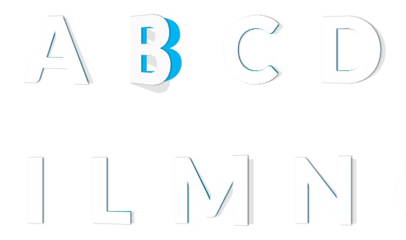
HTML5/CSS3 3D文字特效 文字外翻效果
一款基于HTML5的3D文字特效。
核心CSS代码:
- .letter{
- display: inline-block;
- font-weight: 900;
- font-size: 8em;
- margin: 0.2em;
- position: relative;
- color: #00B4F1;
- transform-style: preserve-3d;
- perspective: 400;
- z-index: 1;
- }
- .letter:before, .letter:after{
- position:absolute;
- content: attr(data-letter);
- transform-origin: top left;
- top:0;
- left:0;
- }
- .letter, .letter:before, .letter:after{
- transition: all 0.3s ease-in-out;
- }
- .letter:before{
- color: #fff;
- text-shadow:
- -1px 0px 1px rgba(255,255,255,.8),
- 1px 0px 1px rgba(0,0,0,.8);
- z-index: 3;
- transform:
- rotateX(0deg)
- rotateY(-15deg)
- rotateZ(0deg);
- }
- .letter:after{
- color: rgba(0,0,0,.11);
- z-index:2;
- transform:
- scale(1.08,1)
- rotateX(0deg)
- rotateY(0deg)
- rotateZ(0deg)
- skew(0deg,1deg);
- }
- .letter:hover:before{
- color: #fafafa;
- transform:
- rotateX(0deg)
- rotateY(-40deg)
- rotateZ(0deg);
- }
- .letter:hover:after{
- transform:
- scale(1.08,1)
- rotateX(0deg)
- rotateY(40deg)
- rotateZ(0deg)
- skew(0deg,22deg);
- }
在线演示 源码下载
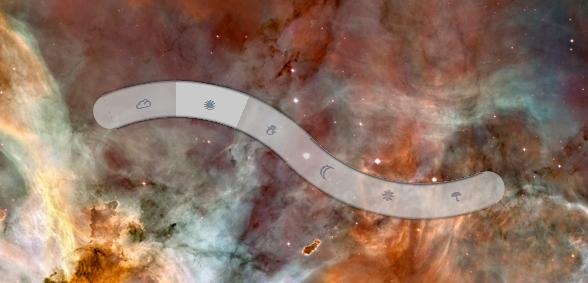
CSS3波浪形菜单 结合背景超级绚丽
一款非常具有创意的CSS3菜单,波浪形状的。
核心CSS代码:
- .b-nav {
- overflow: hidden;
- position: relative;
- margin: 3em auto 0;
- width: 28em; height: 10em;
- }
- .b-menu {
- width: 0; height: 0;
- list-style: none;
- }
- .b-menu li {
- overflow: hidden;
- position: absolute;
- width: 12em; height: 12em;
- }
- .b-menu li:nth-child(-n+3) {
- top: 0.66em; left: -5.68em;
- transform-origin: 100% 100%;
- }
- .b-menu li:nth-child(n+4) {
- right: -5.69em; bottom: 0.66em;
- transform-origin: 0 0;
- }
- .b-menu li:first-child {
- transform: skewY(67.5deg);
- }
- .b-menu li:nth-child(2) {
- transform: rotate(22.5deg) skewY(67.5deg);
- }
- .b-menu li:nth-child(3) {
- transform: rotate(45deg) skewY(67.5deg);
- }
- .b-menu li:nth-child(4) {
- transform: skewY(67.5deg);
- }
- .b-menu li:nth-child(5) {
- transform: rotate(22.5deg) skewY(67.5deg);
- }
- .b-menu li:last-child {
- transform: rotate(45deg) skewY(67.5deg);
- }
- .b-menu a, .b-menu li:after {
- position: absolute;
- border-radius: 50%;
- box-shadow: 0 0 .2em black, inset 0 0 .2em black;
- transform: skewY(-67.5deg) rotate(-11.25deg);
- }
- .b-menu a {
- width: 200%; height: 200%;
- opacity: .7;
- background: radial-gradient(transparent 57.3%,
- #c9c9c9 57.7%);
- color: #7a8092;
- font: 900 1em/2.5 sans-serif;
- text-align: center;
- text-decoration: none;
- transition: .5s;
- }
- .b-menu li:nth-child(n+4) a {
- top: -100%; left: -100%;
- line-height: 45.5;
- }
- .b-menu a:hover { opacity: 1; }
- .b-menu li:after {
- top: 19%; left: 19%;
- width: 162%; height: 162%;
- content: '';
- }
- .b-menu li:nth-child(n+4):after {
- top: auto; right: 19%; bottom: 19%; left: auto;
- }
- .b-menu:before, .b-menu:after {
- position: absolute;
- width: 1em; height: 2.1em;
- opacity: .7;
- background: #c9c9c9;
- content: '';
- }
- .b-menu:before {
- top: 1.75em; left: 1.21em;
- border-radius: 100% 0 0 100%/ 50% 0 0 50%;
- transform: rotate(-22.5deg);
- }
- .b-menu:after {
- bottom: 1.75em; right: 1.21em;
- border-radius: 0 100% 100% 0/ 0 50% 50% 0;
- transform: rotate(-22.5deg);
- }
在线演示 源码下载
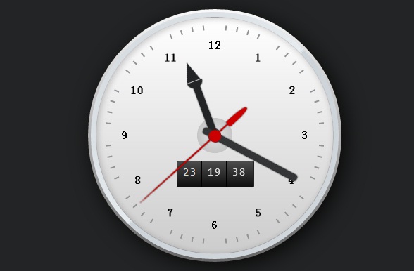
HTML5/CSS3时尚的圆盘时钟动画 带当前日期
又是一款HTML5圆盘时钟动画。
核心CSS代码:
- #watch .minute-marks li:first-child {transform:rotate(6deg) translateY(-12.7em)}
- #watch .minute-marks li:nth-child(2) {transform:rotate(12deg) translateY(-12.7em)}
- #watch .minute-marks li:nth-child(3) {transform:rotate(18deg) translateY(-12.7em)}
- #watch .minute-marks li:nth-child(4) {transform:rotate(24deg) translateY(-12.7em)}
- #watch .minute-marks li:nth-child(5) {transform:rotate(36deg) translateY(-12.7em)}
- #watch .minute-marks li:nth-child(6) {transform:rotate(42deg) translateY(-12.7em)}
- #watch .minute-marks li:nth-child(7) {transform:rotate(48deg) translateY(-12.7em)}
- #watch .minute-marks li:nth-child(8) {transform:rotate(54deg) translateY(-12.7em)}
- #watch .minute-marks li:nth-child(9) {transform:rotate(66deg) translateY(-12.7em)}
- #watch .minute-marks li:nth-child(10) {transform:rotate(72deg) translateY(-12.7em)}
- #watch .minute-marks li:nth-child(11) {transform:rotate(78deg) translateY(-12.7em)}
- #watch .minute-marks li:nth-child(12) {transform:rotate(84deg) translateY(-12.7em)}
- #watch .minute-marks li:nth-child(13) {transform:rotate(96deg) translateY(-12.7em)}
- #watch .minute-marks li:nth-child(14) {transform:rotate(102deg) translateY(-12.7em)}
- #watch .minute-marks li:nth-child(15) {transform:rotate(108deg) translateY(-12.7em)}
- #watch .minute-marks li:nth-child(16) {transform:rotate(114deg) translateY(-12.7em)}
- #watch .minute-marks li:nth-child(17) {transform:rotate(126deg) translateY(-12.7em)}
- #watch .minute-marks li:nth-child(18) {transform:rotate(132deg) translateY(-12.7em)}
- #watch .minute-marks li:nth-child(19) {transform:rotate(138deg) translateY(-12.7em)}
- #watch .minute-marks li:nth-child(20) {transform:rotate(144deg) translateY(-12.7em)}
- #watch .minute-marks li:nth-child(21) {transform:rotate(156deg) translateY(-12.7em)}
- #watch .minute-marks li:nth-child(22) {transform:rotate(162deg) translateY(-12.7em)}
- #watch .minute-marks li:nth-child(23) {transform:rotate(168deg) translateY(-12.7em)}
- #watch .minute-marks li:nth-child(24) {transform:rotate(174deg) translateY(-12.7em)}
- #watch .minute-marks li:nth-child(25) {transform:rotate(186deg) translateY(-12.7em)}
- #watch .minute-marks li:nth-child(26) {transform:rotate(192deg) translateY(-12.7em)}
- #watch .minute-marks li:nth-child(27) {transform:rotate(198deg) translateY(-12.7em)}
- #watch .minute-marks li:nth-child(28) {transform:rotate(204deg) translateY(-12.7em)}
- #watch .minute-marks li:nth-child(29) {transform:rotate(216deg) translateY(-12.7em)}
- #watch .minute-marks li:nth-child(30) {transform:rotate(222deg) translateY(-12.7em)}
- #watch .minute-marks li:nth-child(31) {transform:rotate(228deg) translateY(-12.7em)}
- #watch .minute-marks li:nth-child(32) {transform:rotate(234deg) translateY(-12.7em)}
- #watch .minute-marks li:nth-child(33) {transform:rotate(246deg) translateY(-12.7em)}
- #watch .minute-marks li:nth-child(34) {transform:rotate(252deg) translateY(-12.7em)}
- #watch .minute-marks li:nth-child(35) {transform:rotate(258deg) translateY(-12.7em)}
- #watch .minute-marks li:nth-child(36) {transform:rotate(264deg) translateY(-12.7em)}
- #watch .minute-marks li:nth-child(37) {transform:rotate(276deg) translateY(-12.7em)}
- #watch .minute-marks li:nth-child(38) {transform:rotate(282deg) translateY(-12.7em)}
- #watch .minute-marks li:nth-child(39) {transform:rotate(288deg) translateY(-12.7em)}
- #watch .minute-marks li:nth-child(40) {transform:rotate(294deg) translateY(-12.7em)}
- #watch .minute-marks li:nth-child(41) {transform:rotate(306deg) translateY(-12.7em)}
- #watch .minute-marks li:nth-child(42) {transform:rotate(312deg) translateY(-12.7em)}
- #watch .minute-marks li:nth-child(43) {transform:rotate(318deg) translateY(-12.7em)}
- #watch .minute-marks li:nth-child(44) {transform:rotate(324deg) translateY(-12.7em)}
- #watch .minute-marks li:nth-child(45) {transform:rotate(336deg) translateY(-12.7em)}
- #watch .minute-marks li:nth-child(46) {transform:rotate(342deg) translateY(-12.7em)}
- #watch .minute-marks li:nth-child(47) {transform:rotate(348deg) translateY(-12.7em)}
- #watch .minute-marks li:nth-child(48) {transform:rotate(354deg) translateY(-12.7em)}
- #watch .digits {
- width:30em;
- height:30em;
- border-radius:15em;
- position:absolute;
- top:0; left:50%;
- margin-left:-15em;
- }
- #watch .digits li {
- font-size:1.6em;
- display:block;
- width:1.6em;
- height:1.6em;
- position:absolute;
- top:50%; left:50%;
- line-height:1.6em;
- text-align:center;
- margin:-.8em 0 0 -.8em;
- font-weight:bold;
- }
- #watch .digits li:nth-child(1) { transform:translate(3.9em, -6.9em) }
- #watch .digits li:nth-child(2) { transform:translate(6.9em, -4em) }
- #watch .digits li:nth-child(3) { transform:translate(8em, 0) }
- #watch .digits li:nth-child(4) { transform:translate(6.8em, 4em) }
- #watch .digits li:nth-child(5) { transform:translate(3.9em, 6.9em) }
- #watch .digits li:nth-child(6) { transform:translate(0, 8em) }
- #watch .digits li:nth-child(7) { transform:translate(-3.9em, 6.9em) }
- #watch .digits li:nth-child(8) { transform:translate(-6.8em, 4em) }
- #watch .digits li:nth-child(9) { transform:translate(-8em, 0) }
- #watch .digits li:nth-child(10) { transform:translate(-6.9em, -4em) }
- #watch .digits li:nth-child(11) { transform:translate(-3.9em, -6.9em) }
- #watch .digits li:nth-child(12) { transform:translate(0, -8em) }
- #watch .digits:before {
- content:'';
- width:1.6em;
- height:1.6em;
- border-radius:.8em;
- position:absolute;
- top:50%; left:50%;
- margin:-.8em 0 0 -.8em;
- background:#121314;
- }
- #watch .digits:after {
- content:'';
- width:4em;
- height:4em;
- border-radius:2.2em;
- position:absolute;
- top:50%; left:50%;
- margin:-2.1em 0 0 -2.1em;
- border:.1em solid #c6c6c6;
- background:-webkit-radial-gradient(center, ellipse cover, rgba(200,200,200,0), rgba(190,190,190,1) 90%, rgba(130,130,130,1) 100%);
- background:-moz-radial-gradient(center, ellipse cover, rgba(200,200,200,0), rgba(190,190,190,1) 90%, rgba(130,130,130,1) 100%);
- background:radial-gradient(ellipse at center, rgba(200,200,200,0), rgba(190,190,190,1) 90%, rgba(130,130,130,1) 100%);
- }
- @keyframes hours { to {transform:rotate(335deg)} }
- #watch .hours-hand {
- width:.8em;
- height:7em;
- border-radius:0 0 .9em .9em;
- background:#232425;
- position:absolute;
- bottom:50%; left:50%;
- margin:0 0 -.8em -.4em;
- box-shadow:#232425 0 0 2px;
- transform-origin:0.4em 6.2em;
- transform:rotate(-25deg);
- animation:hours 43200s linear 0s infinite;
- }
- #watch .hours-hand:before {
- content:'';
- background:inherit;
- width:1.8em;
- height:.8em;
- border-radius:0 0 .8em .8em;
- box-shadow:#232425 0 0 1px;
- position:absolute;
- top:-.7em; left:-.5em;
- }
- #watch .hours-hand:after {
- content:'';
- width:0; height:0;
- border:.9em solid #232425;
- border-width:0 .9em 2.4em .9em;
- border-left-color:transparent;
- border-right-color:transparent;
- position:absolute;
- top:-3.1em; left:-.5em;
- }
- @keyframes minutes { to {transform:rotate(422deg)} }
- #watch .minutes-hand {
- width:.8em;
- height:12.5em;
- border-radius:.5em;
- background:#343536;
- position:absolute;
- bottom:50%; left:50%;
- margin:0 0 -1.5em -.4em;
- box-shadow:#343536 0 0 2px;
- transform-origin:0.4em 11em;
- transform:rotate(62deg);
- animation:minutes 3600s linear 0s infinite;
- }
- @keyframes seconds { to {transform:rotate(480deg)} }
- #watch .seconds-hand {
- width:.2em;
- height:14em;
- border-radius:.1em .1em 0 0/10em 10em 0 0;
- background:#c00;
- position:absolute;
- bottom:50%; left:50%;
- margin:0 0 -2em -.1em;
- box-shadow:rgba(0,0,0,.8) 0 0 .2em;
- transform-origin:0.1em 12em;
- transform:rotate(120deg);
- animation:seconds 60s steps(60, end) 0s infinite;
- }
- #watch .seconds-hand:after {
- content:'';
- width:1.4em;
- height:1.4em;
- border-radius:.7em;
- background:inherit;
- position:absolute;
- left:-.65em; bottom:1.35em;
- }
- #watch .seconds-hand:before {
- content:'';
- width:.8em;
- height:3em;
- border-radius:.2em .2em .4em .4em/.2em .2em 2em 2em;
- box-shadow:rgba(0,0,0,.8) 0 0 .2em;
- background:inherit;
- position:absolute;
- left:-.35em; bottom:-3em;
- }
- #watch .digital-wrap {
- width:9em;
- height:3em;
- border:.1em solid #222;
- border-radius:.2em;
- position:absolute;
- top:50%; left:50%;
- margin:3em 0 0 -4.5em;
- overflow:hidden;
- background:#4c4c4c;
- background:-webkit-linear-gradient(top, #4c4c4c 0%,#0f0f0f 100%);
- background:-moz-linear-gradient(top, #4c4c4c 0%, #0f0f0f 100%);
- background:-ms-linear-gradient(top, #4c4c4c 0%,#0f0f0f 100%);
- background:-o-linear-gradient(top, #4c4c4c 0%,#0f0f0f 100%);
- background:linear-gradient(to bottom, #4c4c4c 0%,#0f0f0f 100%);
- }
- #watch .digital-wrap ul {
- float:left;
- width:2.85em;
- height:3em;
- border-right:.1em solid #000;
- color:#ddd;
- font-family:Consolas, monaco, monospace;
- }
- #watch .digital-wrap ul:last-child { border:none }
- #watch .digital-wrap li {
- font-size:1.5em;
- line-height:2;
- letter-spacing:2px;
- text-align:center;
- position:relative;
- left:1px;
- }
- #watch .digit-minutes li {
- animation:dsm 3600s steps(60, end) 0s infinite;
- }
- #watch .digit-seconds li {
- animation:dsm 60s steps(60, end) 0s infinite;
- }
- @keyframes dsm {
- to { transform:translateY(-120em) }
- }
在线演示 源码下载
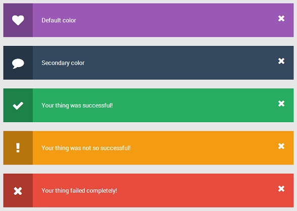
CSS3带图标提示插件 多主题颜色
一款基于CSS3样式提示框插件,色彩比较丰富。
在线演示 源码下载
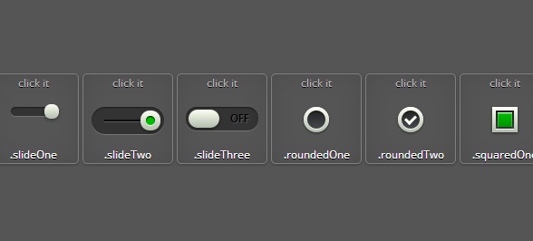
CSS3漂亮的自定义checkbox复选框 9款迷人样式
很酷的CSS3自定义checkbox插件,样式很丰富。
在线演示 源码下载
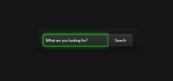
HTML5/CSS3发光搜索表单 超酷CSS3表单
在线演示 源码下载
CSS3悬停动画工具提示效果
在线演示 源码下载
HTML5自定义Checkbox和Radiobox 很酷的选中动画
非常不错的一款HTML5 教程,可以让你自定义checkbox和radiobox。
核心CSS代码:
- .check-box {
- width: 22px;
- height: 22px;
- cursor: pointer;
- display: inline-block;
- margin: 2px 7px 0 0;
- position: relative;
- overflow: hidden;
- box-shadow: 0 0 1px #ccc;
- -webkit-border-radius: 3px;
- -moz-border-radius: 3px;
- border-radius: 3px;
- background: rgb(255, 255, 255);
- background: -moz-linear-gradient(top, rgba(255, 255, 255, 1) 0%, rgba(246, 246, 246, 1) 47%, rgba(237, 237, 237, 1) 100%);
- background: -webkit-gradient(linear, left top, left bottom, color-stop(0%, rgba(255, 255, 255, 1)), color-stop(47%, rgba(246, 246, 246, 1)), color-stop(100%, rgba(237, 237, 237, 1)));
- background: -webkit-linear-gradient(top, rgba(255, 255, 255, 1) 0%, rgba(246, 246, 246, 1) 47%, rgba(237, 237, 237, 1) 100%);
- background: -o-linear-gradient(top, rgba(255, 255, 255, 1) 0%, rgba(246, 246, 246, 1) 47%, rgba(237, 237, 237, 1) 100%);
- background: -ms-linear-gradient(top, rgba(255, 255, 255, 1) 0%, rgba(246, 246, 246, 1) 47%, rgba(237, 237, 237, 1) 100%);
- background: linear-gradient(to bottom, rgba(255, 255, 255, 1) 0%, rgba(246, 246, 246, 1) 47%, rgba(237, 237, 237, 1) 100%);
- filter: progid:DXImageTransform.Microsoft.gradient(startColorstr='#ffffff', endColorstr='#ededed', GradientType=0);
- border: 1px solid #ccc;
- }
- .check-box i {
- background: url('css/check_mark.png') no-repeat center center;
- position: absolute;
- left: 3px;
- bottom: -15px;
- width: 16px;
- height: 16px;
- opacity: .5;
- -webkit-transition: all 400ms ease-in-out;
- -moz-transition: all 400ms ease-in-out;
- -o-transition: all 400ms ease-in-out;
- transition: all 400ms ease-in-out;
- -webkit-transform:rotateZ(-180deg);
- -moz-transform:rotateZ(-180deg);
- -o-transform:rotateZ(-180deg);
- transform:rotateZ(-180deg);
- }
- .checkedBox {
- -moz-box-shadow: inset 0 0 5px 1px #ccc;
- -webkit-box-shadow: inset 0 0 5px 1px #ccc;
- box-shadow: inset 0 0 5px 1px #ccc;
- border-bottom-color: #fff;
- }
- .checkedBox i {
- bottom: 2px;
- -webkit-transform:rotateZ(0deg);
- -moz-transform:rotateZ(0deg);
- -o-transform:rotateZ(0deg);
- transform:rotateZ(0deg);
- }
- /*Custom radio button*/
- .radio-btn {
- width: 20px;
- height: 20px;
- display: inline-block;
- float: left;
- margin: 3px 7px 0 0;
- cursor: pointer;
- position: relative;
- -webkit-border-radius: 100%;
- -moz-border-radius: 100%;
- border-radius: 100%;
- border: 1px solid #ccc;
- box-shadow: 0 0 1px #ccc;
- background: rgb(255, 255, 255);
- background: -moz-linear-gradient(top, rgba(255, 255, 255, 1) 0%, rgba(246, 246, 246, 1) 47%, rgba(237, 237, 237, 1) 100%);
- background: -webkit-gradient(linear, left top, left bottom, color-stop(0%, rgba(255, 255, 255, 1)), color-stop(47%, rgba(246, 246, 246, 1)), color-stop(100%, rgba(237, 237, 237, 1)));
- background: -webkit-linear-gradient(top, rgba(255, 255, 255, 1) 0%, rgba(246, 246, 246, 1) 47%, rgba(237, 237, 237, 1) 100%);
- background: -o-linear-gradient(top, rgba(255, 255, 255, 1) 0%, rgba(246, 246, 246, 1) 47%, rgba(237, 237, 237, 1) 100%);
- background: -ms-linear-gradient(top, rgba(255, 255, 255, 1) 0%, rgba(246, 246, 246, 1) 47%, rgba(237, 237, 237, 1) 100%);
- background: linear-gradient(to bottom, rgba(255, 255, 255, 1) 0%, rgba(246, 246, 246, 1) 47%, rgba(237, 237, 237, 1) 100%);
- filter: progid:DXImageTransform.Microsoft.gradient(startColorstr='#ffffff', endColorstr='#ededed', GradientT
【干货分享 超炫丽的HTML5/jQuery应用及代码】相关文章
本文来源:https://www.51html5.com/a1318.html
﹝干货分享 超炫丽的HTML5/jQuery应用及代码﹞相关内容
- 14款华丽的最新jQuery焦点图动画插件
- 使用 jQuery & CSS3 制作美丽的照片画廊
- 分享10个超实用的jQuery代码片段
- jQuery/HTML5超炫全屏焦点图插件
- 5款让人跃跃欲试的 jQuery 超炫插件
- Jquery实现超炫的弹出层特效
- 10款超炫的开源jquery的源码预览效果
- jQuery超炫图片3D背景视觉差特效插件
- 5款让人跃跃欲试的 jQuery 超炫插件
- jQuery Migrate 1.1 发布,jQuery 应用迁移辅助插件