CSS3切角选项卡tabs
今天你将学习如何创建使用CSS3渐变技术实现切角的选项卡tabs。
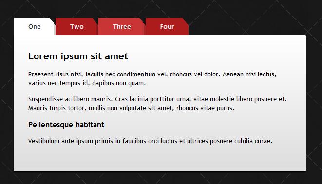
HTML <ul id="tabs"> <li><a href="#" title="tab1">One</a></li> <li><a href="#" title="tab2">Two</a></li> <li><a href="#" title="tab3">Three</a></li> <li><a href="#" title="tab4">Four</a></li></ul> <div id="content"> <div id="tab1">One - content</div> <div id="tab2">Two - content</div> <div id="tab3">Three - content</div> <div id="tab4">Four - content</div></div> CSStabs{ overflow: auto; width: 100%; list-style: none; margin: 0; padding: 0;} #tabs li{ margin: 0; padding: 0; float: left;} #tabs a{ -moz-box-shadow: -4px 0 0 rgba(0, 0, 0, .2); -webkit-box-shadow: -4px 0 0 rgba(0, 0, 0, .2); box-shadow: -4px 0 0 rgba(0, 0, 0, .2); background: #ad1c1c; background: -moz-linear-gradient(220deg, transparent 10px, #ad1c1c 10px); background: -webkit-linear-gradient(220deg, transparent 10px, #ad1c1c 10px); background: -ms-linear-gradient(220deg, transparent 10px, #ad1c1c 10px); background: -o-linear-gradient(220deg, transparent 10px, #ad1c1c 10px); background: linear-gradient(220deg, transparent 10px, #ad1c1c 10px); text-shadow: 0 1px 0 rgba(0,0,0,.5); color: #fff; float: left; font: bold 12px/35px 'Lucida sans', Arial, Helvetica; height: 35px; padding: 0 30px; text-decoration: none;} #tabs a:hover{ background: #c93434; background: -moz-linear-gradient(220deg, transparent 10px, #c93434 10px); background: -webkit-linear-gradient(220deg, transparent 10px, #c93434 10px); background: -ms-linear-gradient(220deg, transparent 10px, #c93434 10px); background: -o-linear-gradient(220deg, transparent 10px, #c93434 10px); background: linear-gradient(220deg, transparent 10px, #c93434 10px);} #tabs a:focus{ outline: 0;} #tabs #current a{ background: #fff; background: -moz-linear-gradient(220deg, transparent 10px, #fff 10px); background: -webkit-linear-gradient(220deg, transparent 10px, #fff 10px); background: -ms-linear-gradient(220deg, transparent 10px, #fff 10px); background: -o-linear-gradient(220deg, transparent 10px, #fff 10px); background: linear-gradient(220deg, transparent 10px, #fff 10px); text-shadow: none; color: #333;} #content{ background-color: #fff; background-image: -webkit-gradient(linear, left top, left bottom, from(#fff), to(#ddd)); background-image: -webkit-linear-gradient(top, #fff, #ddd); background-image: -moz-linear-gradient(top, #fff, #ddd); background-image: -ms-linear-gradient(top, #fff, #ddd); background-image: -o-linear-gradient(top, #fff, #ddd); background-image: linear-gradient(top, #fff, #ddd); -moz-border-radius: 0 2px 2px 2px; -webkit-border-radius: 0 2px 2px 2px; border-radius: 0 2px 2px 2px; -moz-box-shadow: 0 2px 2px #000, 0 -1px 0 #fff inset; -webkit-box-shadow: 0 2px 2px #000, 0 -1px 0 #fff inset; box-shadow: 0 2px 2px #000, 0 -1px 0 #fff inset; padding: 30px;} /* Remove the rule below if you want the content to be "organic" */#content div{ height: 220px;} jQuery
$(document).ready(function() { $("#content div").hide(); // Initially hide all content $("#tabs li:first").attr("id","current"); // Activate first tab $("#content div:first").fadeIn(); // Show first tab content $('#tabs a').click(function(e) { e.preventDefault(); $("#content div").hide(); //Hide all content $("#tabs li").attr("id",""); //Reset id's $(this).parent().attr("id","current"); // Activate this $('#' + $(this).attr('title')).fadeIn(); // Show content for current tab });})();
【CSS3切角选项卡tabs】相关文章
6. HTML5编辑器:JavaScript IDE WebStorm
7. Bombsville
8. HTML5-WebSocket实现对服务器CPU实时监控
本文来源:https://www.51html5.com/a980.html
﹝CSS3切角选项卡tabs﹞相关内容
- Websocket 协议解析
- Vpon发布SDK3.0玩转LBS广告创新5宗“最”
- 新浪微博2012版手机客户端出炉 强化H5技术及LBS功能
- 以HTML5技术为标准的Google Wave将基于BSD协议开源
- HTML5(WebSockets)的脆弱性?
- 为LBS添彩 HTML5 Geolocation定位应用
- Playcraft Labs推HTML5游戏快速开发引擎
- Webshims Lib--不错的HTML5类库
- cssSandpaper-兼容IE的CSS3 JavaScript库
- 一款先进的 CSS3 代码生成工具EnjoyCSS